Crafting Consistency: IG’s Rebranding Journey
Crafting Consistency: IG’s Rebranding Journey
Crafting Consistency: IG’s Rebranding Journey
Crafting Consistency: IG’s Rebranding Journey
Crafting Consistency: IG’s Rebranding Journey
Crafting Consistency: IG’s Rebranding Journey
Role
Senior Product Designer
Product
Trading Platforms, Website
Industry
Fintech
From Origins to Innovation
From Origins to Innovation
IG Group is a renowned and globally recognized financial services provider that originated in the UK in 1974. Specializing in online trading and investment solutions, the company offers a diverse range of financial instruments, including stocks, indices, commodities, and CFD contracts.
Offering cutting-edge trading options, IG addresses a diverse audience through the IG Trading Platform, IG Trading App, MetaTrader 4, and ProRealTime. With a longstanding reputation as a trusted industry player, this brand remains a top preference for traders in search of a dependable and comprehensive environment for their financial endeavors.
New Identity and Enhanced Experiences
New Identity and Enhanced Experiences
IG underwent a rebrand due to the dynamic nature of the market and the adoption of a new business strategy aimed at diversifying its product offerings. The rebrand sought to instill confidence among both new and existing audiences by positioning IG as an 'emotional how' within the group. The goal was to refresh the visual and verbal identity, ensuring a stronger presence for the brand throughout the entire user experience.
The transformation aimed to shift IG from a functional, product-centric organization to an emotive, experience-driven brand.

Core considerations included authenticity, achieved by expressing the brand personality and tone of the 'emotional how' visually and verbally; differentiation, addressing the need to stand out in a disrupted marketplace through a dynamic design toolkit; and relevance, ensuring prominence across the entire end-to-end experience across various markets.
The guiding experience principles (Transparent, Open, Immersive, Unified, Intuitive, and Customized) highlighted the brand's commitment to creating a positive and engaging user experience. The desired brand personality traits (Straightforward, Energetic, Empowering, and Client-Obsessed) reflected the emotional connection IG aimed to establish with its audience. The brand promise, "We inspire confidence," encapsulated the overarching objective of the rebranding effort.
Crafting Change: My Contribution to the Rebrand
Crafting Change: My Contribution to the Rebrand
In my role as a senior product designer, the key responsibilities encompassed:
In my role as a senior product designer, the key responsibilities encompassed:
1
Crafting a cohesive direction and style for all IG.com pages (web + mobile) and native applications (trading platforms)
1
Crafting a cohesive direction and style for all IG.com pages (web + mobile) and native applications (trading platforms)
1
Crafting a cohesive direction and style for all IG.com pages (web + mobile) and native applications (trading platforms)
2
Leading the creation of a dedicated design system for the new brand, covering documentation for typography, color schemes, tokens, and components based on atomic design principles
2
Leading the creation of a dedicated design system for the new brand, covering documentation for typography, color schemes, tokens, and components based on atomic design principles
2
Leading the creation of a dedicated design system for the new brand, covering documentation for typography, color schemes, tokens, and components based on atomic design principles
3
Developing prototypes for usability testing, facilitating in-depth analysis and optimization of user interactions
3
Developing prototypes for usability testing, facilitating in-depth analysis and optimization of user interactions
3
Developing prototypes for usability testing, facilitating in-depth analysis and optimization of user interactions
4
Conducting recruitments/support in building additional design teams to work on native applications and websites
4
Conducting recruitments/support in building additional design teams to work on native applications and websites
4
Conducting recruitments/support in building additional design teams to work on native applications and websites
5
Collaborating with external agencies to actively support the brand transformation
5
Collaborating with external agencies to actively support the brand transformation
5
Collaborating with external agencies to actively support the brand transformation
6
Providing guidance and support to other product designers involved in the process
6
Providing guidance and support to other product designers involved in the process
6
Providing guidance and support to other product designers involved in the process
7
Maintaining open communication with various development teams to ensure a consistent implementation
7
Maintaining open communication with various development teams to ensure a consistent implementation
7
Maintaining open communication with various development teams to ensure a consistent implementation
Scope of work
Scope of work
In the course of this project, we executed a scope of work, incorporating branding workshops, user research, wireframing, UI/IxD design, prototyping, design system development, and user testing. These strategic initiatives were implemented to breathe new life into the brand and enhance user experience.
In the course of this project, we executed a scope of work, incorporating branding workshops, user research, wireframing, UI/IxD design, prototyping, design system development, and user testing. These strategic initiatives were implemented to breathe new life into the brand and enhance user experience.
Challenges
Challenges
A significant aspect of rebrand involved crafting individual sections and an overarching style that seamlessly accommodated diverse language versions for various countries.
Addressing stakeholder demands, particularly the insistence on a red primary call-to-action (CTA) – a color sometimes associated with a "destructive/negative" state in certain design systems – presented a notable challenge. This requirement, driven by a crucial business directive, mandated that all primary action buttons share the same color as the IG logo.
Adapting to the project's scope, roadmap, and development constraints posed a third substantial challenge. Legacy source code in products like trading platforms meant that any layout or section overhaul would consume a significant amount of development time.

Synchronizing all elements concurrently to prevent any product from lagging or becoming outdated in terms of style and rebranding was also a noteworthy challenge. The objective was to implement global changes simultaneously.
A substantial investment of time was also dedicated to capturing screenshots of the current IG.com pages and applications, adjusting everything accordingly. Harmonizing the color palette was another significant task, considering the prior palette's complexity, with hundreds of color tags across three themes (Navy, Light, and Dark). Post-rebrand, the aim was to streamline it to just two: Light and Dark.
Creating a cohesive iconography also proved demanding, requiring consistency in shapes, thickness, and overall style.

Branding Workshops
Branding Workshops
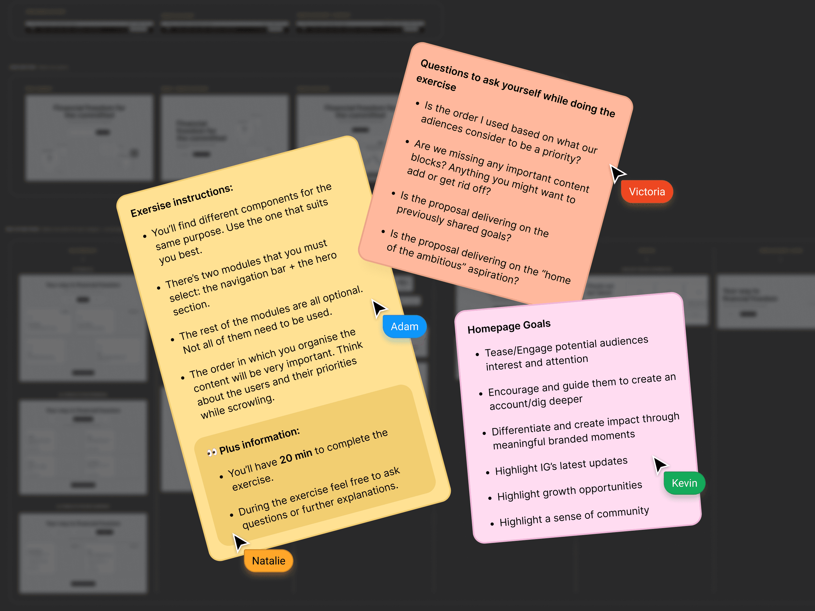
In the interactive UX workshop, participants engaged in a challenge involving the selection and arrangement of various design components. The task included mandatory modules – the navigation bar and hero section – with the freedom to choose from optional parts.
Within a 20-minute timeframe, participants were tasked with arranging the selected modules strategically, considering user priorities during scrolling. The exercise emphasized user-centric thinking and allowed participants to seek clarification or ask questions during the process, fostering collaboration and continual learning.
User Research Overview
User Research Overview
The user research phase involved a combination of immersive field studies and comprehensive surveys. Conducted across diverse user segments, we observed real-world interactions and collected valuable feedback. Additionally, in-depth interviews provided better insights into user preferences and expectations. This multi-faceted approach ensured a holistic understanding of user behavior, guiding our decisions throughout the rebranding process.
The user research phase involved a combination of immersive field studies and comprehensive surveys. Conducted across diverse user segments, we observed real-world interactions and collected valuable feedback. Additionally, in-depth interviews provided better insights into user preferences and expectations. This multi-faceted approach ensured a holistic understanding of user behavior, guiding our decisions throughout the rebranding process.

Sketches & Wireframes
Sketches & Wireframes
We initiated the UX design process with sketches during the discovery phase. Swiftly iterating on lo-fi wireframes, we identified optimal solutions. These materials served as a foundation for interface designs and usability testing.
We initiated the UX design process with sketches during the discovery phase. Swiftly iterating on lo-fi wireframes, we identified optimal solutions. These materials served as a foundation for interface designs and usability testing.

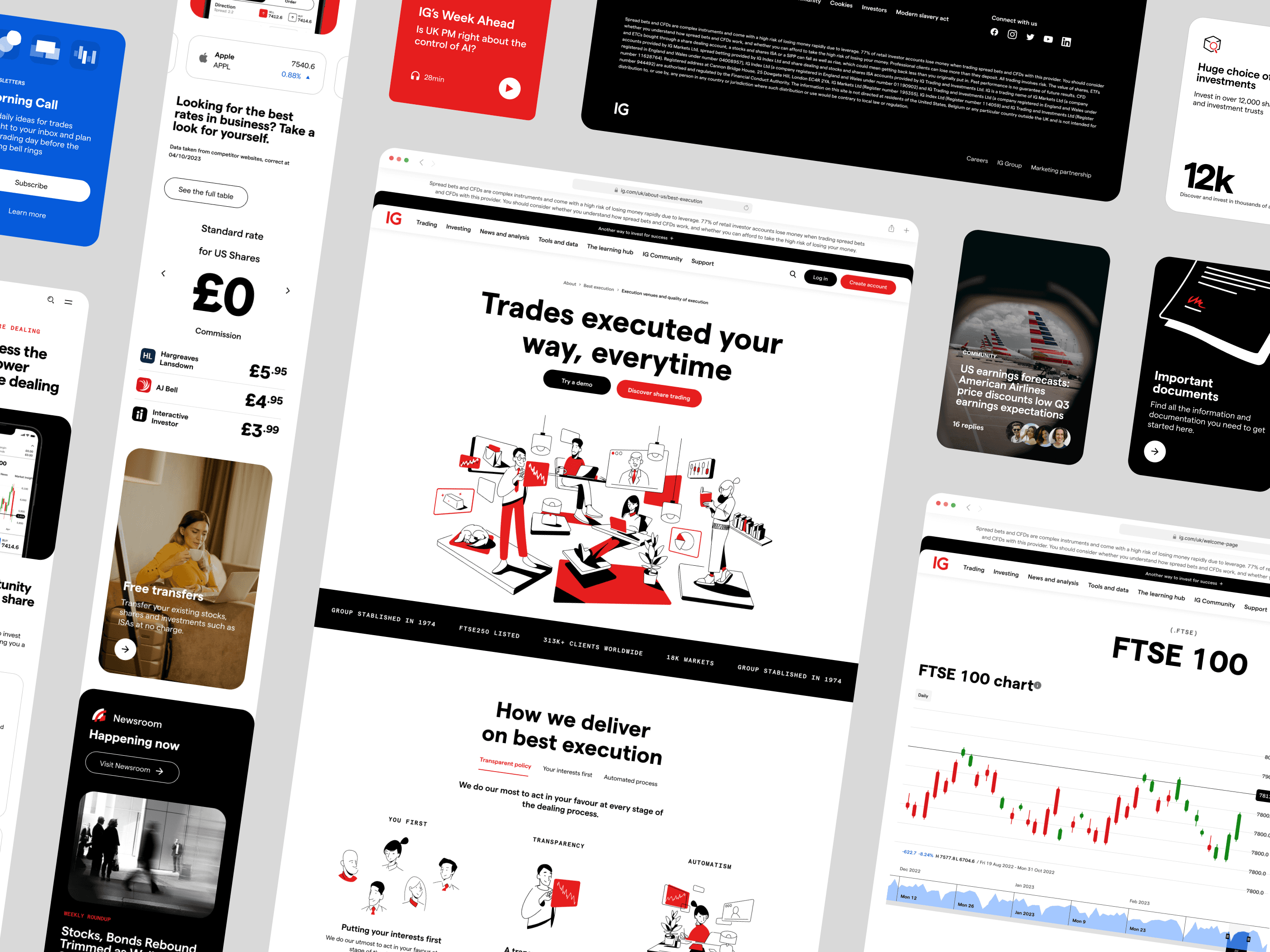
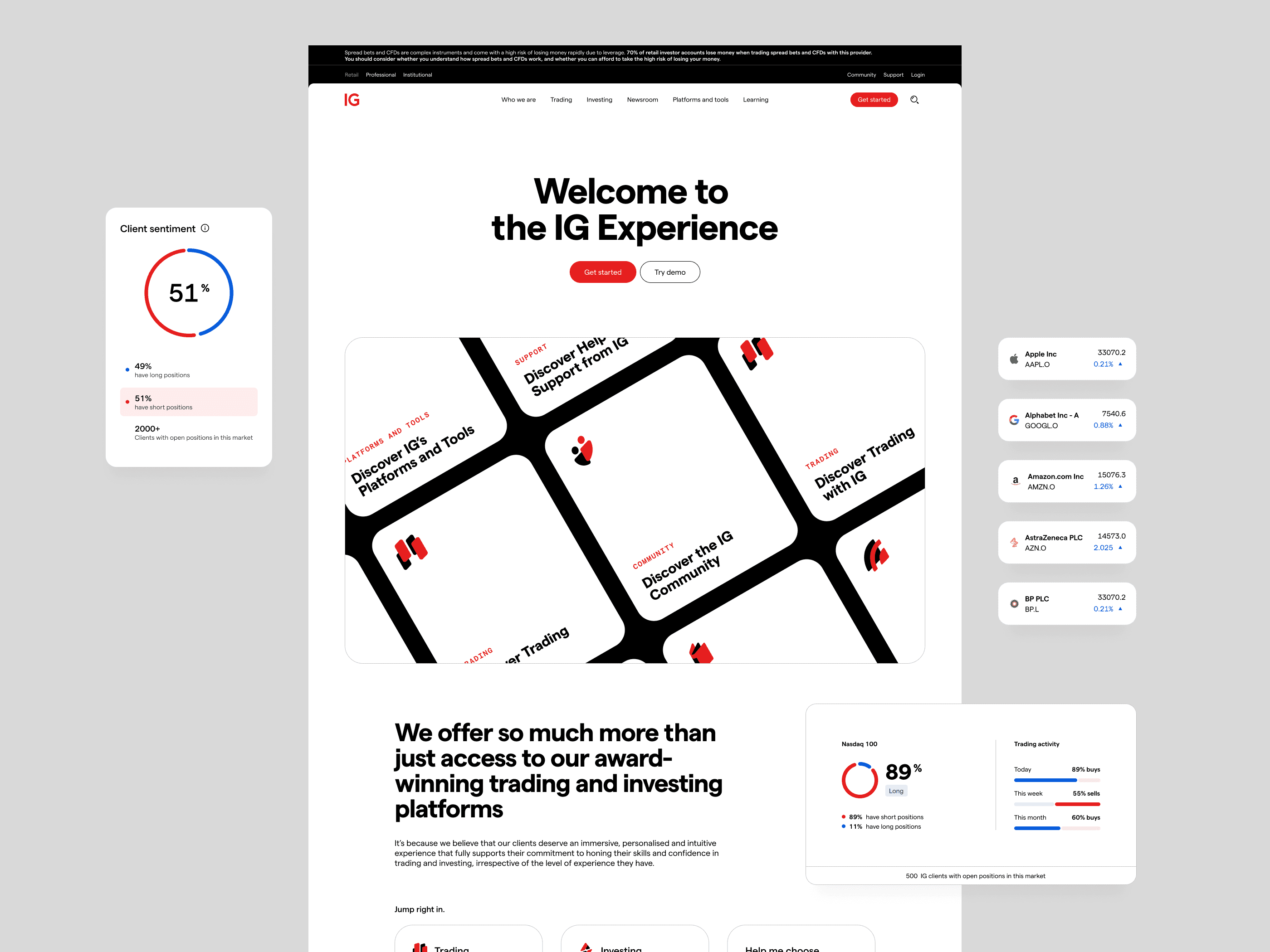
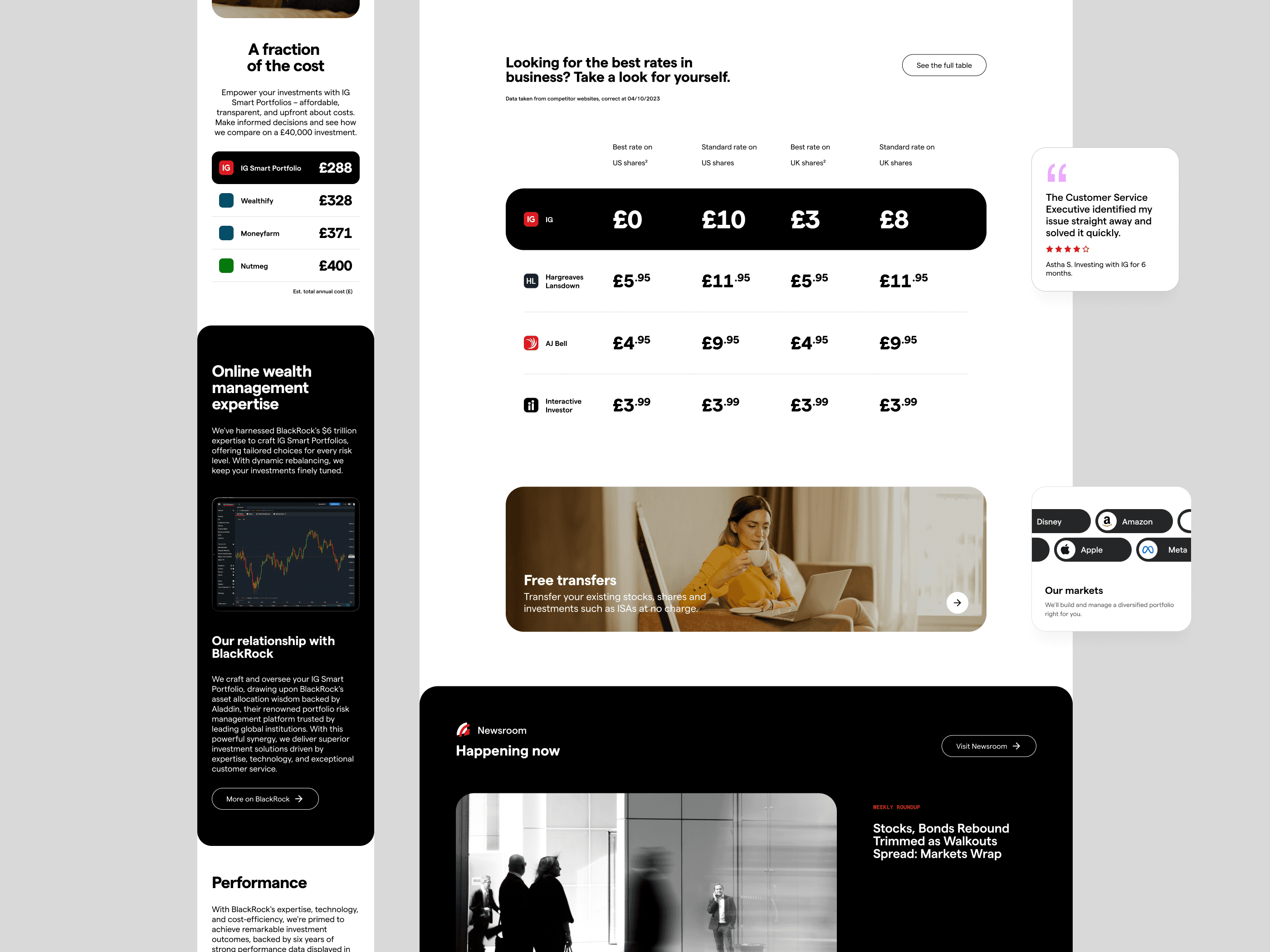
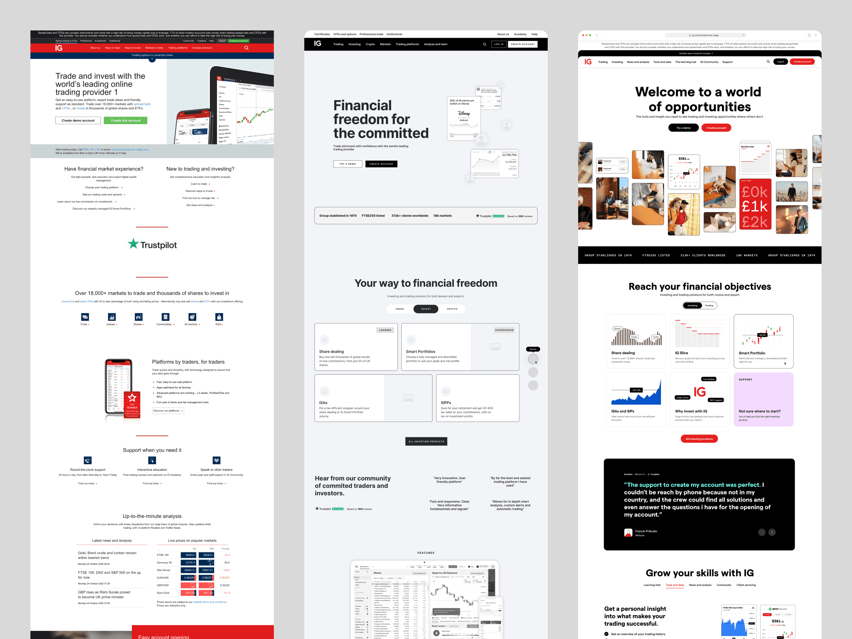
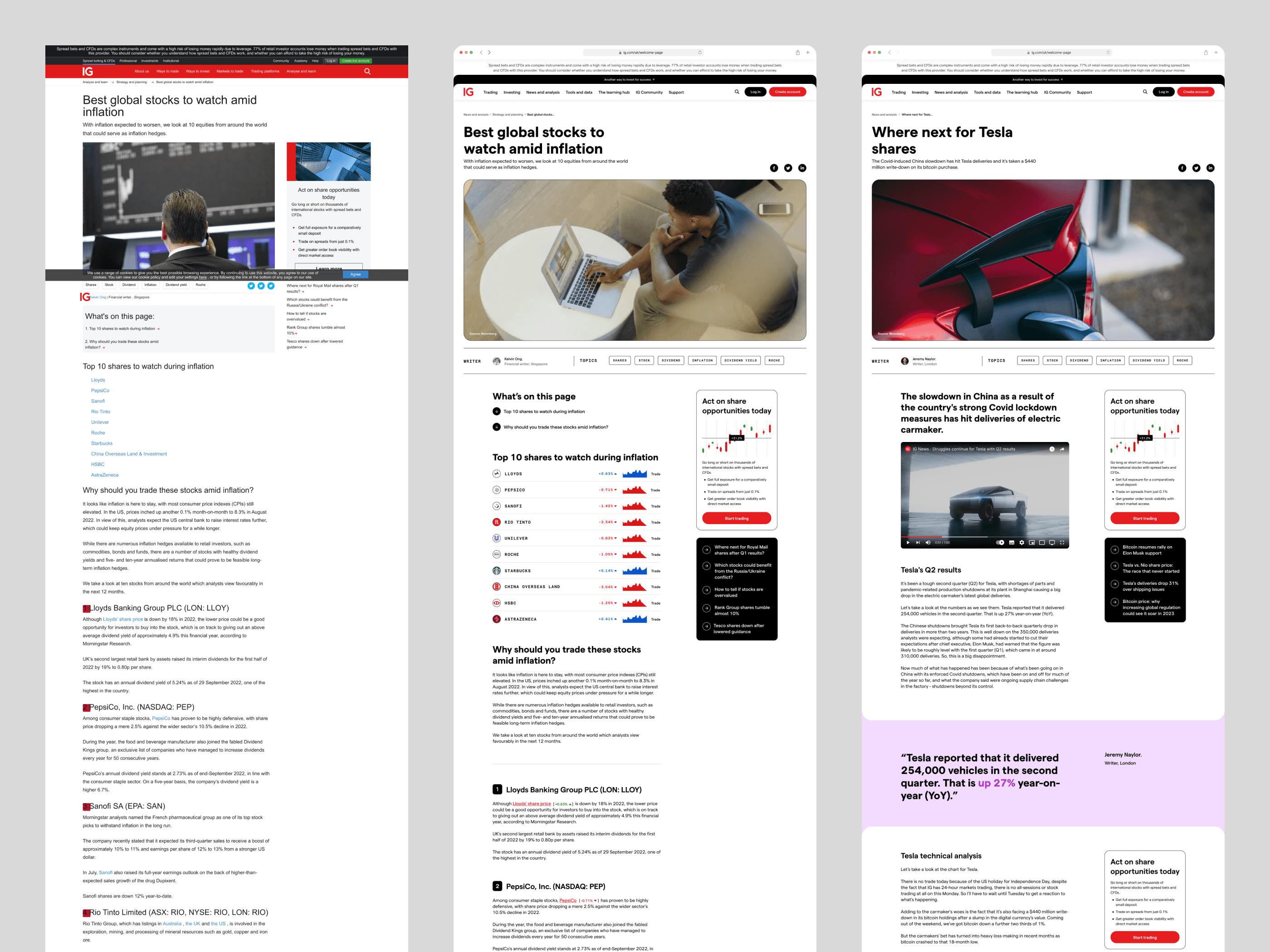
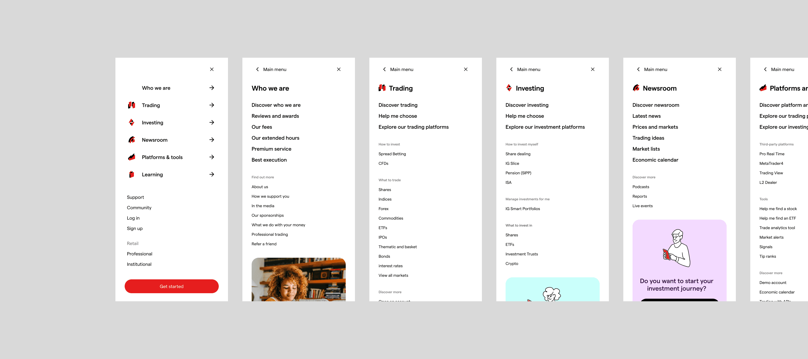
Website redesign
Website redesign
In crafting IG.com, we drew inspiration from the entire journey, incorporating insights gained from the earlier stages like Branding Workshops and User Research. The redesign process was a thoughtful culmination, ensuring that every detail resonated with the brand identity while catering to the unique needs and preferences uncovered during our exploration.
Importantly, when designing all these pages, we diligently adhered to WCAG standards, emphasizing accessibility to provide an inclusive and user-friendly online experience.

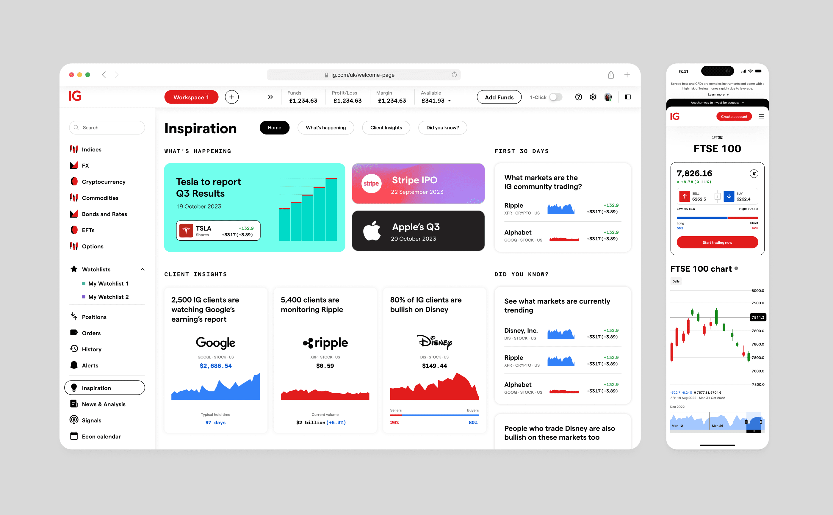
Trading Platform and Mobile App
Trading Platform and Mobile App
As we revamped IG.com, we were also giving a makeover to the native applications - both the Web and Mobile Trading Platform. Doing this at the same time was our way of ensuring that the new brand vibes were introduced across all of IG's products simultaneously.
As we revamped IG.com, we were also giving a makeover to the native applications - both the Web and Mobile Trading Platform. Doing this at the same time was our way of ensuring that the new brand vibes were introduced across all of IG's products simultaneously.
Brand Palette
Brand Palette
IG's color scheme is anchored in three primary colors: red, black and white. These essential tags serve the dual purpose of distinguishing IG in the market and cultivating brand awareness and equity.
Supporting the core palette are secondary colors and a grayscale, comprising a functional selection. The secondary colors, chosen for their ability to infuse warmth and energy, complement the core IG palette seamlessly. Meanwhile, the grayscale and functional range ensure a uniform and cohesive use of color across all our communications and platforms.

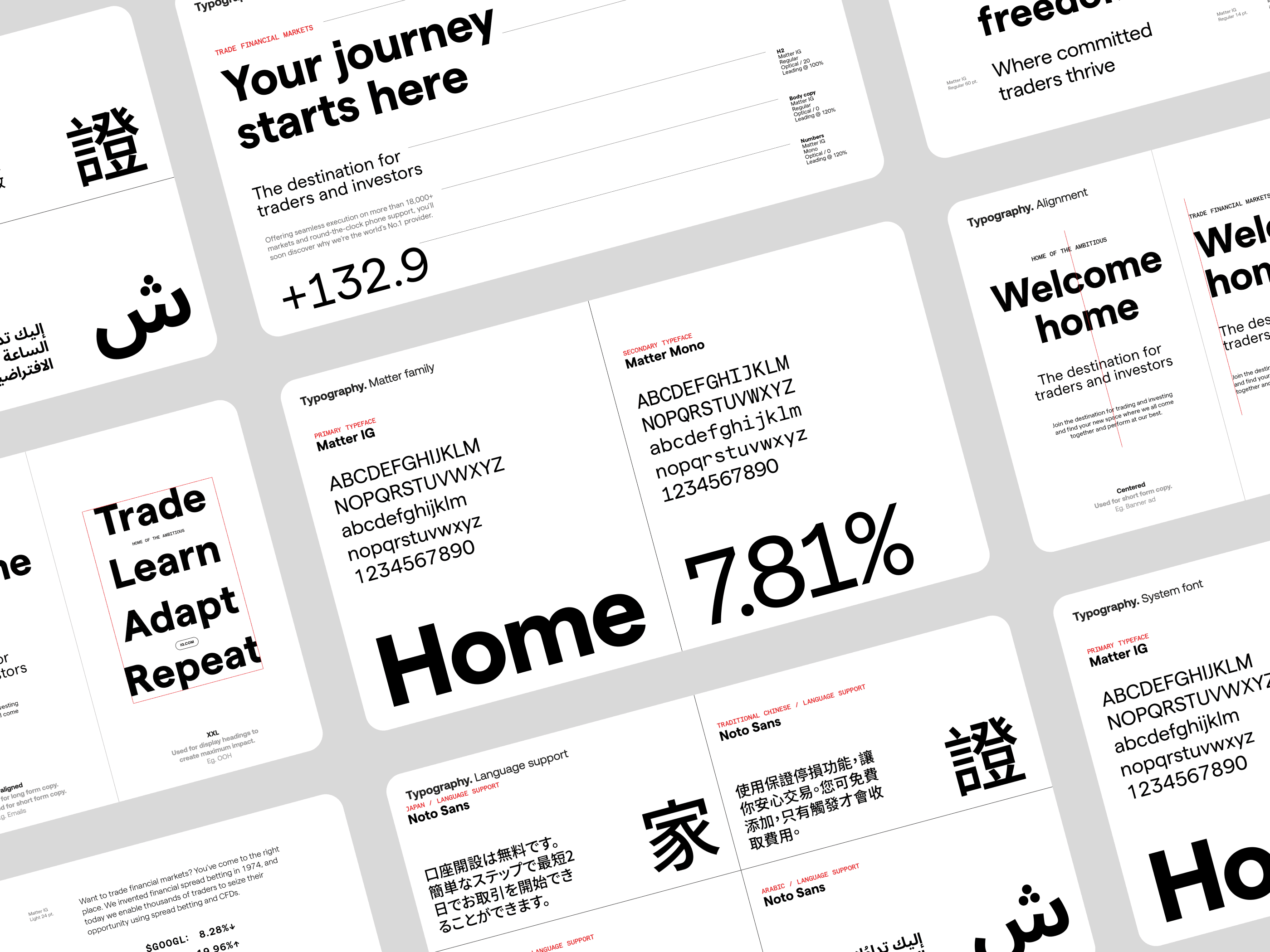
Typography
Typography
The typographic system utilized a customized version of Matter and Matter Mono, specifically adapted for IG. This provided a visual representation of voice and allowed the brand to communicate in a bold yet straightforward manner.
We led with IG Matter Bold to ensure confidence in our typography. The system was supported by additional weights of Matter and Matter Mono, enhancing typographic hierarchy, especially when incorporating numerals.
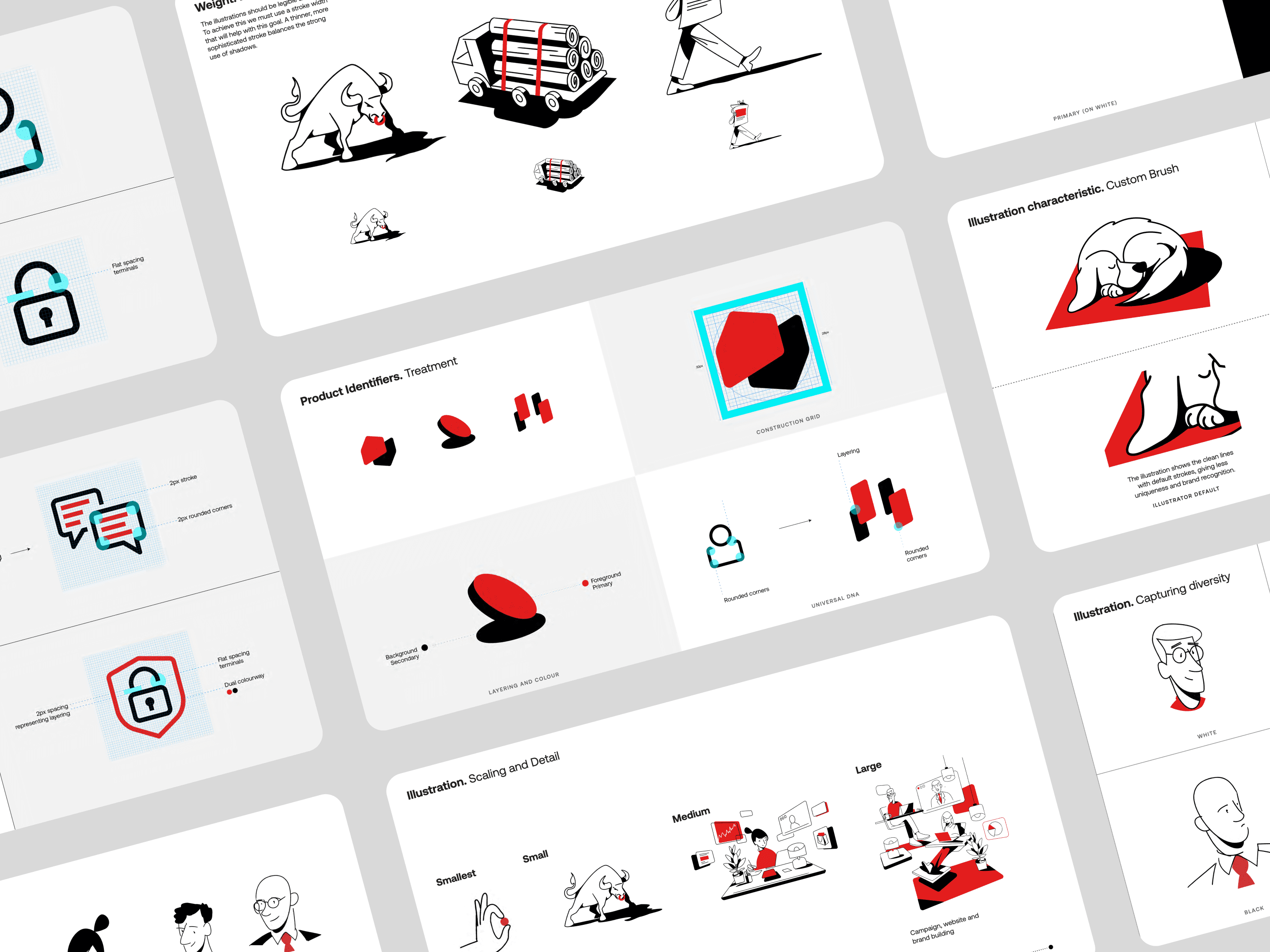
Iconography and Illustration
Iconography and Illustration
The iconography and illustration system was a way to make all our visuals look the same and work together. It covered things like icons on the screen, product symbols, and different kinds of illustrations for communication.
The iconography and illustration system was a way to make all our visuals look the same and work together. It covered things like icons on the screen, product symbols, and different kinds of illustrations for communication.
Data Visualisation
Data Visualisation
The approach to visualizing data aimed to make our data look the same, whether in our product or communications. We created a set of ways to show data (like pie charts, ring charts, bar graphs, line graphs, etc.) that could be adjusted in size and style.
The approach to visualizing data aimed to make our data look the same, whether in our product or communications. We created a set of ways to show data (like pie charts, ring charts, bar graphs, line graphs, etc.) that could be adjusted in size and style.

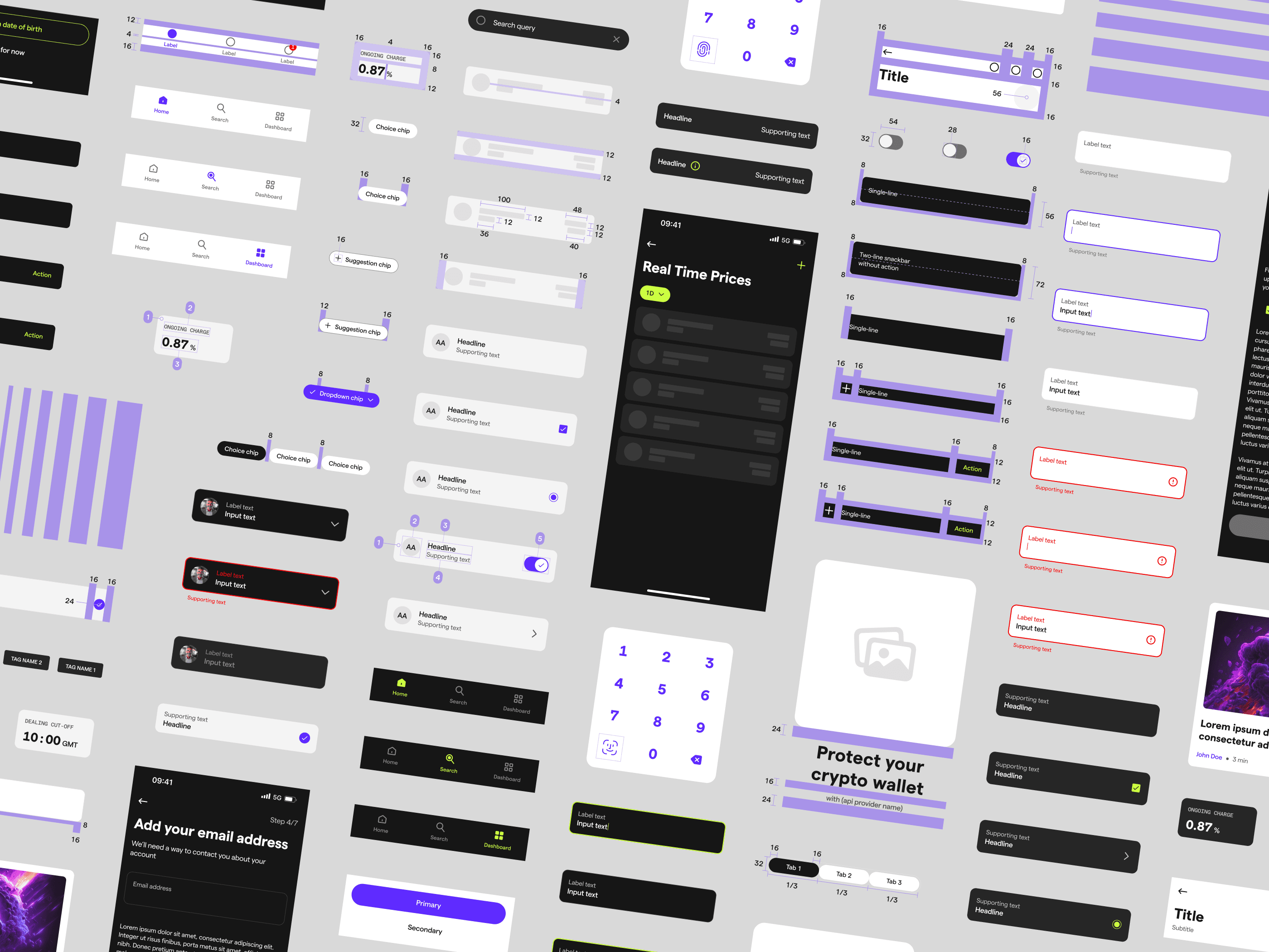
Design System
Design System
During the rebranding journey, a major focus was on crafting a dedicated design system rooted in atomic design principles.
As the lead of a four-person team dedicated to expanding this library, we carefully outlined guidelines covering colors, fonts, icons, grids, and the sizing/spacing of various design elements. Our meticulous work resulted in the creation of over 200 components, each with different states and variations. This not only enhanced our team's collaboration but also led to cost savings and increased efficiency.
This ensured that any future additions or modifications seamlessly integrated with the existing style. The success of this effort is reflected in a unified and visually appealing design across all IG platforms, underscoring our commitment to delivering a cohesive and enjoyable user experience.
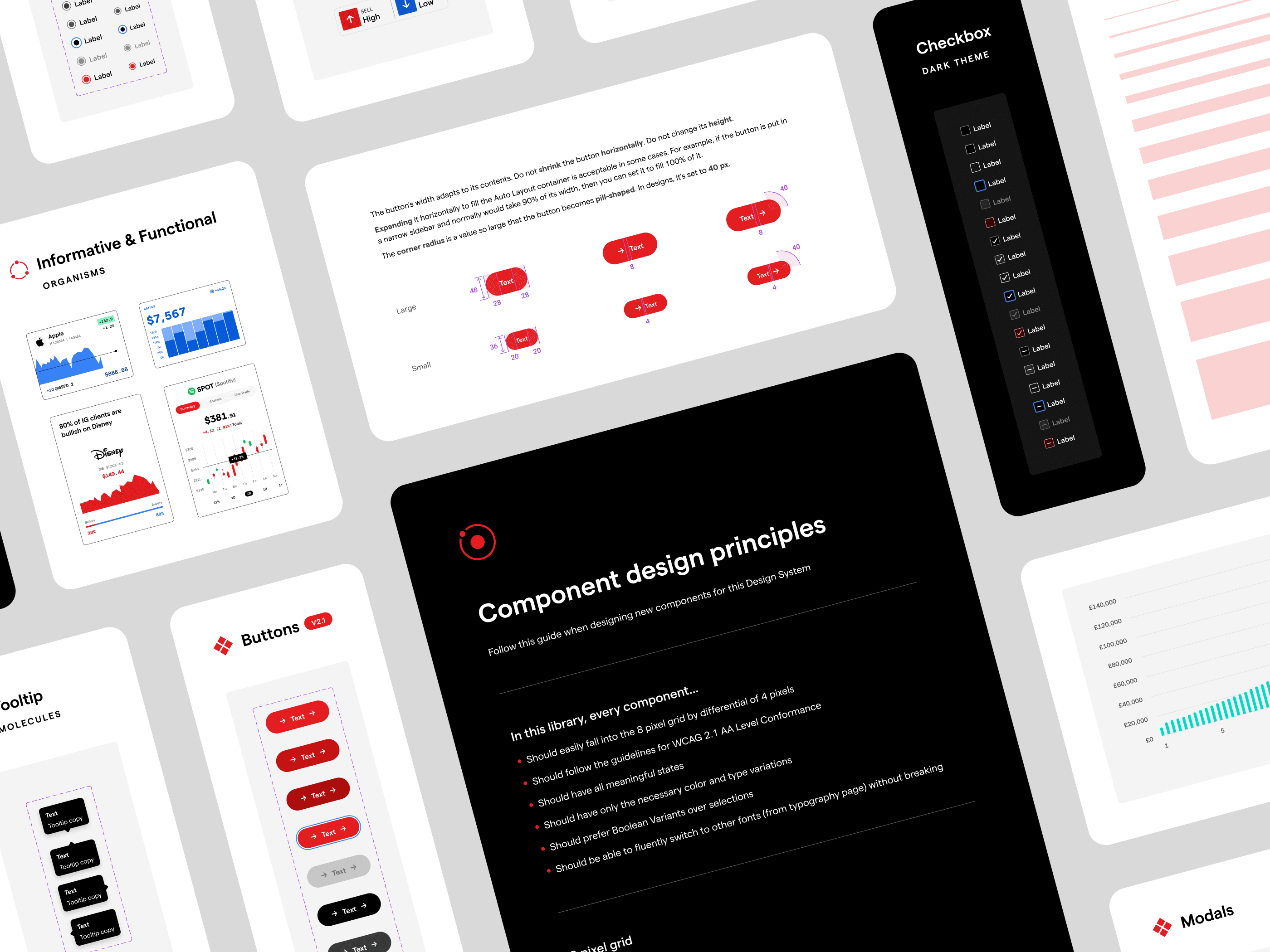
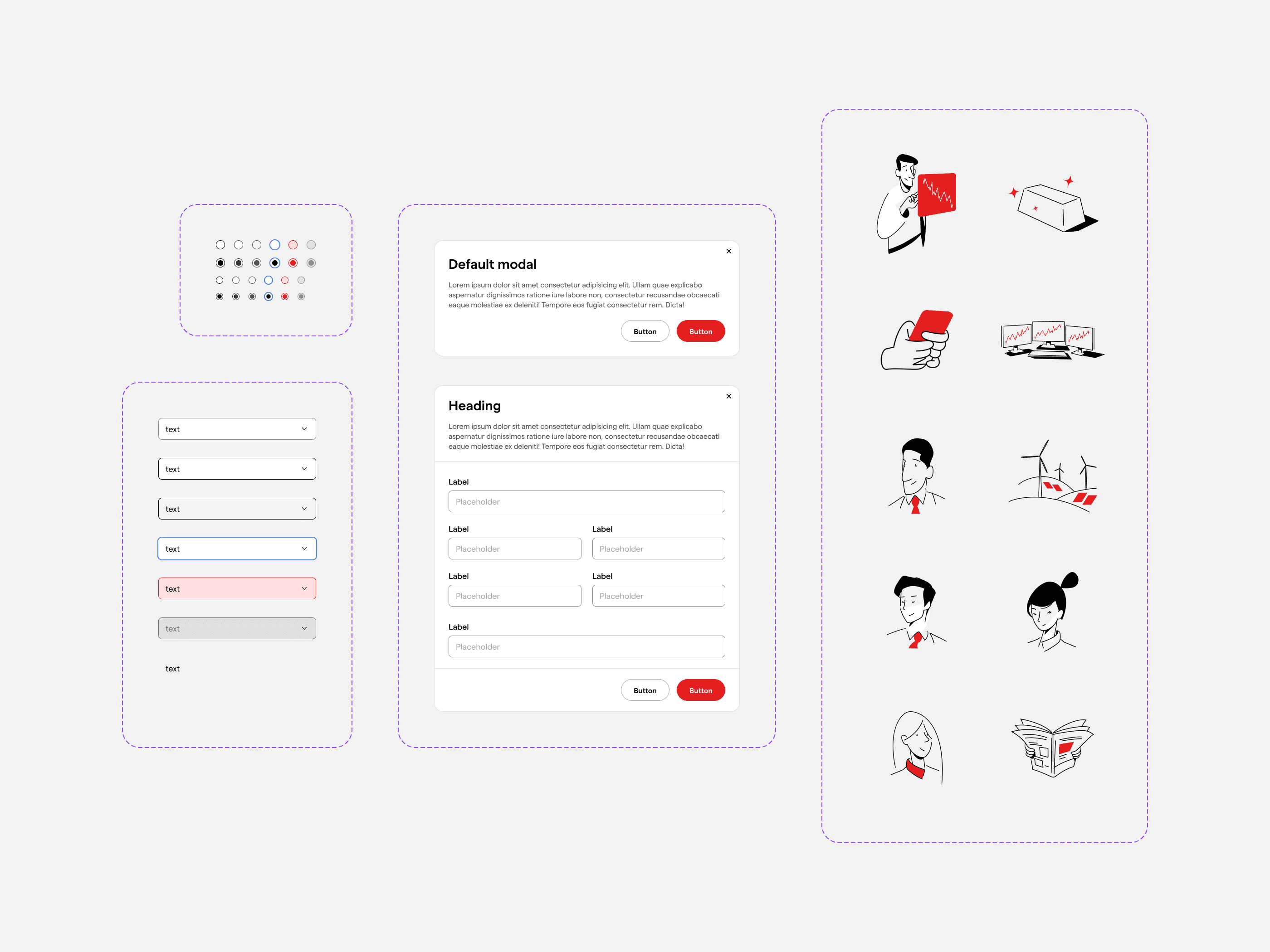
Variants
Variants
Within the design system, we incorporated reusable components like buttons, forms, and navigation elements.
These UI materials, carefully designed and standardized, serve as building blocks that can be efficiently utilized across various sections of the product. This not only streamlines the design and development process but also ensures consistency and coherence throughout IG's diverse offerings.
Guidelines
Guidelines
The IG Brand Library extended beyond components, offering guidelines on the utilization of core elements and providing insights into layout, spacing, and other design considerations.
These guidelines were instrumental in maintaining a consistent and coherent visual language across diverse sections of the product. By adhering to these standards, IG ensured a unified and polished user experience across its entire platform.

User Testing and Iterative Development
User Testing and Iterative Development
After getting our designs ready, the next step was testing them with real users and making individual improvements. We created dedicated prototypes and tested them with different groups, from new traders to experienced ones (for different markets in separate language versions). The valuable feedback we gathered from these sessions, carefully documented on Miro, steered us in the direction of continuous iterations.
We looped through multiple rounds of user testing, making adjustments based on feedback until we achieved highly positive results. This commitment to continuous testing and refinement played a pivotal role in shaping a final product that met and exceeded our expectations.

Final thoughts
Final thoughts
The extensive rebranding journey of IG's products reflects a commitment to evolution and user-centric design. Beginning with foundational Branding Workshops, progressing through meticulous User Testing and Iterative Development, and anchored by a prepared Design System, each phase contributed to a more user-friendly and globally resonant IG experience.
The parallel transformation of IG.com and native applications, coupled with iterative refinements, ensured a synchronized and cohesive brand feel across all platforms. Through the lens of accessibility and continuous user feedback, IG's rebranding stands as a testament to adaptability, inclusivity, and a relentless pursuit of excellence in the ever-evolving landscape of online trading.
As a team, we take pride in what we have accomplished, shaping IG's brand for the future.

Thank you!
Thank you!
Thank you for taking the time to read this study 🙂 If you have any questions or need more information, feel free to reach out. Looking forward to chatting with you!
Thank you for taking the time to read this study 🙂 If you have any questions or need more information, feel free to reach out. Looking forward to chatting with you!